The changing face of office space
One of the lasting impacts of the pandemic has been on office spaces, many of which have laid empty for several years. Landlords and employers are having to think quite differently about commercial office design as employees now need a much more enticing space in order to draw them in and away from home.
This is where, as an interior designer, I can help. Because I understand how to make a home feel good, I can apply some of the same principles to making a workspace feel welcoming and comfortable.
Designing a commercial office space might appear to have little in common with designing a home, but they’re not so different. Both need places for quiet contemplation, for social interaction, for concentration; places that provide open views of the space, while at the same time making the occupants feel shielded and safe; places for privacy, for conviviality or play. These are all key principles which underpin biophilic design.
Read more about biophilic design in my blog post.
Feeling at home, at work
So when my client asked me to look at an office space he was managing in Farringdon, I knew I had the right skills to create this commercial office design. With some thoughtful treatment I could use my residential experience and some biophilic design principles to transform it into a more lettable space.
My client asked me to: create a comfortable and relaxed space; introduce colour and texture to soften the hard edges and create a more biophilic feel; build in corners for quiet contemplation and retreat; and develop areas which made both collaborative and quiet, reflective work possible.
In order to do this I knew it would be important to create zones, address acoustics, and make sure that the occupants would have some sense of control over their working environment. I also wanted to make sure that the office reflected the character of Farringdon, its location. The budget wasn’t big but there was still lots of potential to soften the edges of this monochrome and uninspiring space.
Take a look at the floor plan I designed.
Sustainability
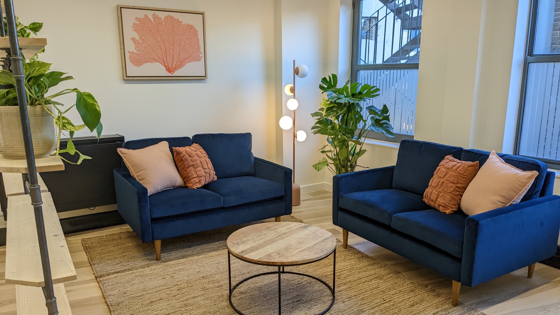
There were some existing pieces of furniture and fittings within the space which we reused in order to reduce the project’s carbon footprint. The sofas and coffee table were sourced from suppliers with a clear commitment to sustainability, and other items were sourced in natural materials such as jute, linen, and organic cotton. Using natural materials can not only reduce the environmental impact of a project, but it can also enhance the occupants’ wellbeing.
Read more about the benefits of using natural materials.


Biophilic design details
I selected a colour palette that would fuse a sense of maturity (represented by a deep blue) with energy and warmth (represented by earthy reds and oranges), to capture the spirit of Farringdon. Saturated colours created a sense of vigour but I tempered this with organic shapes and textures that would soothe and restore anyone working in the office. A large picture of a coral which resembled a neural or mycelial network drew a biophilic parallel with Farringdon’s history as a communications and transport hub. I also made reference to the area’s epicurean roots through a graphic poster depicting a steaming bowl of ramen.
Every desk had its own table lamp so that anyone working there could control their own light levels, while I added some floor lamps which emitted a soft and relaxing glow. The space was divided into different zones which facilitated both individual and collaborative working. A new informal seating zone ensured that there was somewhere to chill out or have a more relaxed meeting with a colleague. Most importantly, I oriented all desks so that no one would have to sit with their back to the door, unless they had some screening behind them. Natural light was obscured as little as possible, and zoning took into account the views and vistas within the space. Soft furnishings, leafy plants and paper lanterns provided some acoustic diffusion.
View more design details on my Pinterest board.
Following this biophilic design approach enabled me to create a commercial office space that feels warm and welcoming. It will support creativity and productivity. Most importantly, it’s a working space which will feel worth travelling into.
To get my help with your own commercial office design, please contact me.

